HTML <div> tag revisited
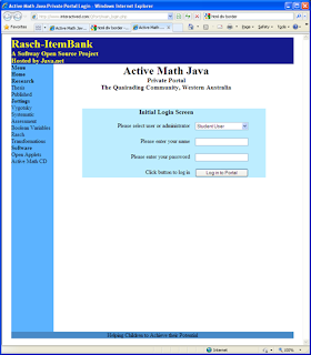
<div> tag laid out login page, which seemed to look so great in Windows Internet Explorer (see below), looked absolutely crap in Firefox (see further below). So I did some reading, and the theme seemed to be that tables were never intended to do layout. Well I reckon there should be a counter argument, that the <div> tag was never intended to present data.
It seems to me that much of the orthodoxy around HTML is written by graphic artists or publishers, and most of the web sites purported to show the power of <div> tags and CSS, are littered with graphic art and fancy fonts.
For anyone used to programming, meshing <div> tags and CSS is not technically difficult, but perhaps it is not second nature to graphic artists and literary publishers. The instructions emphasize the importance of closing tags, and they suggest using borders during the design phase to get a visual aid on the layout of the divisions.
So I tried that. I show below the HTML for the beginning of a login page:
<body>
<div id="container">
<div id="pageHeader">
<h1><span>Rasch-ItemBank</span></h1>
<h3><span>A <a class="top" href="http://www.interactived.com/softway.htm">
Softway</a> Open Source Project <br>
Hosted by <a class="top" href="http://java.net/projects">Java.net</a></span></h3>
</div><!-- end of "pageHeader" -->
<div id="pageBody">
<h3><span><h3>Initial Login Screen</h3></span></h3>
<div id="cellA1">
<p><span>Please select user or administrator</span></p>
</div><!-- end of "cellA1" -->
<div id="cellB1">
<p><span><select name="usertype" class=cbox>
<option value="user">Student User</option>
<option value="admin">Administrator</option>
</select></span></p>
</div><!-- end of "cellB1" -->
</div><!-- end of "pageBody" -->
</div><!-- end of "container" -->
</body>
</html>
And below is the CSS to go with it:
#container {
padding: 0 25px 0 120px;
margin: 0;
position: relative;
border: 1px dotted red;
}
#pageHeader {
margin: 5px;
border: 1px dotted orange;
}
#pageBody {
margin: 5px;
border: 1px dotted green;
}
#cellA1 {
margin: 2px;
height: 35px;
float: left;
border: 1px dotted fuchsia;
}
#cellB1 {
margin: 2px;
height: 35px;
float: left;
border: 1px dotted fuchsia;
}
I put little margins around each "division", and I made the borders different colors for clarity. Having rainbows on my mind, I followed a rainbow sequence: Richard of .. gave .. vain. I show below how it came out:
Notice how the red border, which is supposed to embrace everything, stops short, and leaves off two divisions. And the green border, which was created to embrace the "table" and its heading, wraps itself around the heading only.
After many hours of fiddling, I noticed that the "divisions" behave better if they contain background images, but it strikes me that padding out divisions with background images to make them behave predictably, is conceptually not far removed from padding out real tables with spacer gifs.
So I shall put my login form, and all other forms back into tables. I may use CSS to format the tables, and I may use divisions in pages and areas of pages devoted to text and graphics. But my data and forms will be laid out in the traditional manner, using tables.


Comments